纯CSS3实现的鼠标悬停显示遮罩效果 对于前段不熟悉的我只有多记录记录所用过的技术了。 需求:当鼠标放到图片上时,图片上方将出现一个带透明度的遮罩层。 贴代码:
<div :height="contentHeight"> <Avatar :width="66" :src="src" class="**he_slideCaptionDown**"> <div v-font="12" v-color:dark> <p>姓名:{{d.pname}}</p> <p>编号:{{d.pcode}}</p> </div> <div class="**he_slideCaptionDown_caption**"> <div class="**he_slideCaptionDown_caption_h**"> <div class="h-tooltip-show"> <Button color="green" @click.stop="open('edit', d.uuid)" style="border:0px;border-radius: 0px">修改</Button> <Poptip content="确认删除?" @confirm="del(d.uuid)"> <Button color="red" style="border:0px;border-radius: 0px;">删除</Button> </Poptip> </div> </div> </div> </Avatar> </div> 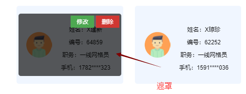样式主要为上面标粗的代码,其他样式这里暂时用不到,其他的样式是用来其他效果的,具体看这个网址:https://www.helloweba.net/javascript/312.html 需要引入的样式为: .
he_border1 { background: #fe7253; width: 360px; height: 240px; padding: 0; margin: 0; border: 1px solid #000; position: relative; box-sizing: border-box; -webkit-transition: all .4s ease-in-out; -moz-transition: all .4s ease-in-out; -o-transition: all .4s ease-in-out; -ms-transition: all .4s ease-in-out; transition: all .4s ease-in-out; overflow: hidden } .he_border1 .he_border1_img { display: block; width: 100%; padding: 0; margin: 0; position: relative; -webkit-transition: all .4s ease-in-out; -moz-transition: all .4s ease-in-out; -o-transition: all .4s ease-in-out; -ms-transition: all .4s ease-in-out; transition: all .4s ease-in-out; opacity: 1; overflow: hidden } .he_border1:hover .he_border1_img { position: absolute; -webkit-transform: scale(1.1); -moz-transform: scale(1.1); -o-transform: scale(1.1); -ms-transform: scale(1.1); transform: scale(1.1); opacity: .6 } .he_border1 .he_border1_caption { color: #fff; padding: 0; margin: 0; -moz-backface-visibility: hidden; -webkit-backface-visibility: hidden; backface-visibility: hidden; -webkit-transition: all .4s ease-in-out; -moz-transition: all .4s ease-in-out; -o-transition: all .4s ease-in-out; -ms-transition: all .4s ease-in-out; transition: all .4s ease-in-out; overflow: hidden } .he_border1 .he_border1_caption::before, .he_border1 .he_border1_caption::after { position: absolute; content: ''; opacity: 0; -webkit-transition: opacity 0.4s, -webkit-transform .4s; -moz-transition: opacity 0.4s, -moz-transform .4s; -o-transition: opacity 0.4s, -o-transform .4s; transition: opacity 0.4s, transform .4s } .he_border1 .he_border1_caption::before { top: 8%; right: 10%; bottom: 8%; left: 10%; border-top: 1px solid #fff; border-bottom: 1px solid #fff; -webkit-transform: scale(0, 1); -moz-transform: scale(0, 1); -o-transform: scale(0, 1); transform: scale(0, 1); -webkit-transform-origin: 0 0; -moz-transform-origin: 0 0; -o-transform-origin: 0 0; transform-origin: 0 0 } .he_border1 .he_border1_caption::after { top: 8%; right: 10%; bottom: 8%; left: 10%; border-right: 1px solid #fff; border-left: 1px solid #fff; -webkit-transform: scale(1, 0); -moz-transform: scale(1, 0); -o-transform: scale(1, 0); transform: scale(1, 0); -webkit-transform-origin: 100% 0; -moz-transform-origin: 100% 0; -o-transform-origin: 100% 0; transform-origin: 100% 0 } .he_border1:hover .he_border1_caption::before, .he_border1:hover .he_border1_caption::after { opacity: 1; -webkit-transform: scale(1); -moz-transform: scale(1); -o-transform: scale(1); transform: scale(1) } .he_border1 .he_border1_caption, .he_border1 .he_border1_caption>a { position: absolute; top: 0; left: 0; width: 100%; height: 100%; -webkit-transition: all .4s ease-in-out; -moz-transition: all .4s ease-in-out; -o-transition: all .4s ease-in-out; -ms-transition: all .4s ease-in-out; transition: all .4s ease-in-out; overflow: hidden; z-index: 1000 } .he_border1 .he_border1_caption_h { font-size: 1.3em; font-weight: 700; text-align: center; width: 80%; position: absolute; top: 20%; left: 10%; -webkit-transition: all .5s ease-in-out; -moz-transition: all .5s ease-in-out; -o-transition: all .5s ease-in-out; -ms-transition: all .5s ease-in-out; transition: all .5s ease-in-out; overflow: hidden; opacity: 1 } .he_border1 .he_border1_caption_p { font-size: 1em; text-align: center; width: 80%; position: absolute; top: 60%; left: 10%; -webkit-transition: all .4s ease-in-out; -moz-transition: all .4s ease-in-out; -o-transition: all .4s ease-in-out; -ms-transition: all .4s ease-in-out; transition: all .4s ease-in-out; overflow: hidden; opacity: 0 } .he_border1:hover .he_border1_caption_p { top: 45%; opacity: 1 } .he_border2 { background: #fe7253; width: 360px; height: 240px; padding: 0; margin: 0; border: 1px solid #000; position: relative; box-sizing: border-box; -webkit-transition: all .4s ease-in-out; -moz-transition: all .4s ease-in-out; -o-transition: all .4s ease-in-out; -ms-transition: all .4s ease-in-out; transition: all .4s ease-in-out; overflow: hidden } .he_border2 .he_border2_img { display: block; width: 100%; padding: 0; margin: 0; position: relative; opacity: 1; -webkit-transition: all .4s ease-in-out; -moz-transition: all .4s ease-in-out; -o-transition: all .4s ease-in-out; -ms-transition: all .4s ease-in-out; transition: all .4s ease-in-out; overflow: hidden } .he_border2:hover .he_border2_img { position: absolute; -webkit-transform: scale(1.1); -moz-transform: scale(1.1); -o-transform: scale(1.1); -ms-transform: scale(1.1); transform: scale(1.1); opacity: .6 } .he_border2 .he_border2_caption { color: #fff; padding: 0; margin: 0; -moz-backface-visibility: hidden; -webkit-backface-visibility: hidden; backface-visibility: hidden; -webkit-transition: all .4s ease-in-out; -moz-transition: all .4s ease-in-out; -o-transition: all .4s ease-in-out; -ms-transition: all .4s ease-in-out; transition: all .4s ease-in-out; overflow: hidden } .he_border2 .he_border2_caption::before, .he_border2 .he_border2_caption::after { position: absolute; content: ''; opacity: 0; -webkit-transition: opacity 0.4s, -webkit-transform .4s; -moz-transition: opacity 0.4s, -moz-transform .4s; -o-transition: opacity 0.4s, -o-transform .4s; transition: opacity 0.4s, transform .4s } .he_border2 .he_border2_caption::before { top: 14%; right: 5%; bottom: 14%; left: 5%; border-top: 1px solid #fff; border-bottom: 1px solid #fff; -webkit-transform: scale(0, 1); -moz-transform: scale(0, 1); -o-transform: scale(0, 1); transform: scale(0, 1); -webkit-transform-origin: 0 0; -moz-transform-origin: 0 0; -o-transform-origin: 0 0; transform-origin: 0 0 } .he_border2 .he_border2_caption::after { top: 8%; right: 10%; bottom: 8%; left: 10%; border-right: 1px solid #fff; border-left: 1px solid #fff; -webkit-transform: scale(1, 0); -moz-transform: scale(1, 0); -o-transform: scale(1, 0); transform: scale(1, 0); -webkit-transform-origin: 100% 0; -moz-transform-origin: 100% 0; -o-transform-origin: 100% 0; transform-origin: 100% 0 } .he_border2:hover .he_border2_caption::before, .he_border2:hover .he_border2_caption::after { opacity: 1; -webkit-transform: scale(1); -moz-transform: scale(1); -o-transform: scale(1); transform: scale(1) } .he_border2 .he_border2_caption, .he_border2 .he_border2_caption>a { position: absolute; top: 0; left: 0; width: 100%; height: 100%; -webkit-transition: all .4s ease-in-out; -moz-transition: all .4s ease-in-out; -o-transition: all .4s ease-in-out; -ms-transition: all .4s ease-in-out; transition: all .4s ease-in-out; overflow: hidden; z-index: 1000 } .he_border2 .he_border2_caption_h { font-size: 1.3em; font-weight: 700; text-align: center; width: 80%; position: absolute; top: 20%; left: 10%; -webkit-transition: all .5s ease-in-out; -moz-transition: all .5s ease-in-out; -o-transition: all .5s ease-in-out; -ms-transition: all .5s ease-in-out; transition: all .5s ease-in-out; overflow: hidden; opacity: 1 } .he_border2 .he_border2_caption_p { font-size: 1em; text-align: center; width: 80%; position: absolute; top: 60%; left: 10%; -webkit-transition: all .4s ease-in-out; -moz-transition: all .4s ease-in-out; -o-transition: all .4s ease-in-out; -ms-transition: all .4s ease-in-out; transition: all .4s ease-in-out; overflow: hidden; opacity: 0 } .he_border2:hover .he_border2_caption_p { top: 45%; opacity: 1 } .he_border3 { background: #fe7253; width: 360px; height: 240px; padding: 0; margin: 0; border: 1px solid #000; position: relative; box-sizing: border-box; -webkit-transition: all .4s ease-in-out; -moz-transition: all .4s ease-in-out; -o-transition: all .4s ease-in-out; -ms-transition: all .4s ease-in-out; transition: all .4s ease-in-out; overflow: hidden } .he_border3 .he_border3_img { display: block; width: 100%; padding: 0; margin: 0; position: relative; opacity: 1; -webkit-transition: all .4s ease-in-out; -moz-transition: all .4s ease-in-out; -o-transition: all .4s ease-in-out; -ms-transition: all .4s ease-in-out; transition: all .4s ease-in-out; overflow: hidden } .he_border3:hover .he_border3_img { position: absolute; -webkit-transform: scale(1.1); -moz-transform: scale(1.1); -o-transform: scale(1.1); -ms-transform: scale(1.1); transform: scale(1.1); opacity: .6 } .he_border3 .he_border3_caption { color: #fff; padding: 0; margin: 0; -moz-backface-visibility: hidden; -webkit-backface-visibility: hidden; backface-visibility: hidden; -webkit-transition: all .4s ease-in-out; -moz-transition: all .4s ease-in-out; -o-transition: all .4s ease-in-out; -ms-transition: all .4s ease-in-out; transition: all .4s ease-in-out; overflow: hidden } .he_border3 .he_border3_caption::before, .he_border3 .he_border3_caption::after { position: absolute; content: ''; opacity: 0; -webkit-transition: opacity 0.4s, -webkit-transform .4s; -moz-transition: opacity 0.4s, -moz-transform .4s; -o-transition: opacity 0.4s, -o-transform .4s; transition: opacity 0.4s, transform .4s } .he_border3 .he_border3_caption::before { top: 14%; right: 25%; bottom: 14%; left: 25%; border-top: 1px solid #fff; border-bottom: 1px solid #fff; -webkit-transform: scale(0, 1); -moz-transform: scale(0, 1); -o-transform: scale(0, 1); transform: scale(0, 1); -webkit-transform-origin: 0 0; -moz-transform-origin: 0 0; -o-transform-origin: 0 0; transform-origin: 0 0 } .he_border3 .he_border3_caption::after { top: 25%; right: 10%; bottom: 25%; left: 10%; border-right: 1px solid #fff; border-left: 1px solid #fff; -webkit-transform: scale(1, 0); -moz-transform: scale(1, 0); -o-transform: scale(1, 0); transform: scale(1, 0); -webkit-transform-origin: 100% 0; -moz-transform-origin: 100% 0; -o-transform-origin: 100% 0; transform-origin: 100% 0 } .he_border3:hover .he_border3_caption::before, .he_border3:hover .he_border3_caption::after { opacity: 1; -webkit-transform: scale(1); -moz-transform: scale(1); -o-transform: scale(1); transform: scale(1) } .he_border3 .he_border3_caption, .he_border3 .he_border3_caption>a { position: absolute; top: 0; left: 0; width: 100%; height: 100%; -webkit-transition: all .4s ease-in-out; -moz-transition: all .4s ease-in-out; -o-transition: all .4s ease-in-out; -ms-transition: all .4s ease-in-out; transition: all .4s ease-in-out; overflow: hidden; z-index: 1000 } .he_border3 .he_border3_caption_h { font-size: 1.3em; font-weight: 700; text-align: center; width: 80%; position: absolute; top: 20%; left: 10%; -webkit-transition: all .5s ease-in-out; -moz-transition: all .5s ease-in-out; -o-transition: all .5s ease-in-out; -ms-transition: all .5s ease-in-out; transition: all .5s ease-in-out; overflow: hidden; opacity: 1 } .he_border3 .he_border3_caption_p { font-size: 1em; text-align: center; width: 80%; position: absolute; top: 60%; left: 10%; -webkit-transition: all .4s ease-in-out; -moz-transition: all .4s ease-in-out; -o-transition: all .4s ease-in-out; -ms-transition: all .4s ease-in-out; transition: all .4s ease-in-out; overflow: hidden; opacity: 0 } .he_border3:hover .he_border3_caption_p { top: 45%; opacity: 1 } .he_3DFlipX { display: block; width: 360px; height: 240px; overflow: hidden; padding: 0; margin: 0; border: 0; position: relative; box-sizing: border-box; -webkit-perspective: 1700px; -moz-perspective: 1700px; perspective: 1700px; -webkit-perspective-origin: 50% 50%; -moz-perspective-origin: 50% 50%; perspective-origin: 50% 50% } .he_3DFlipX_inner { width: 100%; height: 100%; padding: 0; margin: 0; position: relative; -webkit-transform-style: preserve-3d; -moz-transform-style: preserve-3d; transform-style: preserve-3d } .he_3DFlipX_inner>div.he_3DFlipX_img { backface-visibility: hidden; -webkit-transition: all .5s ease-in-out; -moz-transition: all .5s ease-in-out; transition: all .5s ease-in-out } .he_3DFlipX_inner:hover>div.he_3DFlipX_img { -webkit-transform: rotateX(180deg); -moz-transform: rotateX(180deg); transform: rotateX(180deg) } .he_3DFlipX_inner>div img { max-width: 100%; padding: 0; margin: 0; display: block; position: relative } .he_3DFlipX_caption { position: absolute; top: 0; left: 0; padding: 0; background: #fe7253; color: #fff; height: 100%; width: 100%; padding: 0; margin: 0; opacity: 0; background-color: #fe7253; text-align: center; backface-visibility: hidden; -webkit-transform: rotateX(-180deg); -moz-transform: rotateX(-180deg); transform: rotateX(-180deg); -webkit-transition: all .5s ease-in-out; -moz-transition: all .5s ease-in-out; transition: all .5s ease-in-out } .he_3DFlipX_inner:hover .he_3DFlipX_caption { opacity: 1; -webkit-transform: rotateX(0); -moz-transform: rotateX(0); transform: rotateX(0) } .he_3DFlipX_caption h3 { font-size: 1.3em; font-weight: 700; text-align: center; width: 100%; position: absolute; top: 25%; left: 5px; margin: 0; padding: 0; color: #fff } .he_3DFlipX_caption p { font-size: 1em; text-align: center; width: 100%; position: absolute; top: 45%; left: 5px; margin: 0; padding: 0; color: #fff } .he_3DFlipX a { position: absolute; top: 0; left: 0; width: 100%; height: 100%; padding: 0; margin: 0 } .he_3DFlipY { display: block; width: 360px; height: 240px; overflow: hidden; padding: 0; margin: 0; border: 0; position: relative; box-sizing: border-box; cursor: pointer; -webkit-perspective: 1700px; -moz-perspective: 1700px; perspective: 1700px; -webkit-perspective-origin: 50% 50%; -moz-perspective-origin: 50% 50%; perspective-origin: 50% 50% } .he_3DFlipY_inner { width: 100%; height: 100%; padding: 0; margin: 0; position: relative; -webkit-transform-style: preserve-3d; -moz-transform-style: preserve-3d; transform-style: preserve-3d } .he_3DFlipY_inner>div.he_3DFlipY_img { backface-visibility: hidden; -webkit-transition: all .5s ease-in-out; -moz-transition: all .5s ease-in-out; transition: all .5s ease-in-out } .he_3DFlipY_inner:hover>div.he_3DFlipY_img { -webkit-transform: rotateY(180deg); -moz-transform: rotateY(180deg); transform: rotateY(180deg) } .he_3DFlipY_inner>div img { max-width: 100%; padding: 0; margin: 0; display: block; position: relative } .he_3DFlipY_caption { position: absolute; top: 0; left: 0; padding: 0; background: #fe7253; color: #fff; height: 100%; width: 100%; padding: 0; margin: 0; opacity: 0; background-color: #fe7253; text-align: center; backface-visibility: hidden; -webkit-transform: rotateY(-180deg); -moz-transform: rotateY(-180deg); transform: rotateY(-180deg); -webkit-transition: all .5s ease-in-out; -moz-transition: all .5s ease-in-out; transition: all .5s ease-in-out } .he_3DFlipY_inner:hover .he_3DFlipY_caption { opacity: 1; -webkit-transform: rotateY(0); -moz-transform: rotateY(0); transform: rotateY(0) } .he_3DFlipY_caption h3 { font-size: 1.3em; font-weight: 700; text-align: center; width: 100%; position: absolute; top: 25%; left: 5px; margin: 0; padding: 0; color: #fff } .he_3DFlipY_caption p { font-size: 1em; text-align: center; width: 100%; position: absolute; top: 45%; left: 5px; margin: 0; padding: 0; color: #fff } .he_3DFlipY a { position: absolute; top: 0; left: 0; width: 100%; height: 100%; padding: 0; margin: 0 } .he_ZoomInImg { background: #fe7253; width: 360px; height: 240px; padding: 0; margin: 0; border: 1px solid #000; position: relative; box-sizing: border-box; cursor: pointer; -webkit-transition: all .4s ease-in-out; -moz-transition: all .4s ease-in-out; -o-transition: all .4s ease-in-out; -ms-transition: all .4s ease-in-out; transition: all .4s ease-in-out; overflow: hidden } .he_ZoomInImg .he_ZoomInImg_img { position: relative; display: block; width: 100%; padding: 0; margin: 0; opacity: 1; -webkit-transition: all .4s ease-in-out; -moz-transition: all .4s ease-in-out; -o-transition: all .4s ease-in-out; -ms-transition: all .4s ease-in-out; transition: all .4s ease-in-out; overflow: hidden } .he_ZoomInImg:hover .he_ZoomInImg_img { opacity: .7; -webkit-transform: scale(1.3); -moz-transform: scale(1.3); -o-transform: scale(1.3); -ms-transform: scale(1.3); transform: scale(1.3) } .he_ZoomInImg .he_ZoomInImg_caption { color: #fff; -moz-backface-visibility: hidden; -webkit-backface-visibility: hidden; backface-visibility: hidden; -webkit-transition: all .4s ease-in-out; -moz-transition: all .4s ease-in-out; -o-transition: all .4s ease-in-out; -ms-transition: all .4s ease-in-out; transition: all .4s ease-in-out; overflow: hidden } .he_ZoomInImg .he_ZoomInImg_caption, .he_ZoomInImg .he_ZoomInImg_caption>a { position: absolute; top: 0; left: 0; width: 100%; height: 100%; padding: 0; margin: 0; -webkit-transition: all .4s ease-in-out; -moz-transition: all .4s ease-in-out; -o-transition: all .4s ease-in-out; -ms-transition: all .4s ease-in-out; transition: all .4s ease-in-out; overflow: hidden } .he_ZoomInImg .he_ZoomInImg_caption_h { font-size: 1.3em; font-weight: 700; text-align: center; width: 80%; position: absolute; top: 20%; left: 10%; -webkit-transition: all .5s ease-in-out; -moz-transition: all .5s ease-in-out; -o-transition: all .5s ease-in-out; -ms-transition: all .5s ease-in-out; transition: all .5s ease-in-out; overflow: hidden; opacity: .8 } .he_ZoomInImg:hover .he_ZoomInImg_caption_h { color: #fff; opacity: 1 } .he_ZoomInImg .he_ZoomInImg_caption_p { font-size: 1em; text-align: center; width: 80%; position: absolute; top: 45%; left: 10%; -webkit-transition: all .6s ease-in-out; -moz-transition: all .6s ease-in-out; -o-transition: all .6s ease-in-out; -ms-transition: all .6s ease-in-out; transition: all .6s ease-in-out; overflow: hidden; opacity: 0 } .he_ZoomInImg:hover .he_ZoomInImg_caption_p { color: #fff; opacity: 1 } .he_ZoomOutImg { background: #fe7253; width: 360px; height: 240px; padding: 0; margin: 0; border: 1px solid #000; position: relative; box-sizing: border-box; cursor: pointer; -webkit-transition: all .4s ease-in-out; -moz-transition: all .4s ease-in-out; -o-transition: all .4s ease-in-out; -ms-transition: all .4s ease-in-out; transition: all .4s ease-in-out; overflow: hidden } .he_ZoomOutImg .he_ZoomOutImg_img { position: relative; display: block; width: 100%; padding: 0; margin: 0; opacity: 1; -webkit-transition: all .4s ease-in-out; -moz-transition: all .4s ease-in-out; -o-transition: all .4s ease-in-out; -ms-transition: all .4s ease-in-out; transition: all .4s ease-in-out; overflow: hidden; -webkit-transform: scale(1.3); -moz-transform: scale(1.3); -o-transform: scale(1.3); -ms-transform: scale(1.3); transform: scale(1.3) } .he_ZoomOutImg:hover .he_ZoomOutImg_img { opacity: .7; -webkit-transform: scale(1); -moz-transform: scale(1); -o-transform: scale(1); -ms-transform: scale(1); transform: scale(1) } .he_ZoomOutImg .he_ZoomOutImg_caption { color: #fff; -moz-backface-visibility: hidden; -webkit-backface-visibility: hidden; backface-visibility: hidden; -webkit-transition: all .4s ease-in-out; -moz-transition: all .4s ease-in-out; -o-transition: all .4s ease-in-out; -ms-transition: all .4s ease-in-out; transition: all .4s ease-in-out; overflow: hidden } .he_ZoomOutImg .he_ZoomOutImg_caption, .he_ZoomOutImg .he_ZoomOutImg_caption>a { position: absolute; top: 0; left: 0; width: 100%; height: 100%; padding: 0; margin: 0; -webkit-transition: all .4s ease-in-out; -moz-transition: all .4s ease-in-out; -o-transition: all .4s ease-in-out; -ms-transition: all .4s ease-in-out; transition: all .4s ease-in-out; overflow: hidden } .he_ZoomOutImg .he_ZoomOutImg_caption_h { font-size: 1.3em; font-weight: 700; text-align: center; width: 80%; position: absolute; top: 20%; left: 10%; -webkit-transition: all .5s ease-in-out; -moz-transition: all .5s ease-in-out; -o-transition: all .5s ease-in-out; -ms-transition: all .5s ease-in-out; transition: all .5s ease-in-out; overflow: hidden; opacity: .8 } .he_ZoomOutImg:hover .he_ZoomOutImg_caption_h { color: #fff; opacity: 1 } .he_ZoomOutImg .he_ZoomOutImg_caption_p { font-size: 1em; text-align: center; width: 80%; position: absolute; top: 45%; left: 10%; -webkit-transition: all .6s ease-in-out; -moz-transition: all .6s ease-in-out; -o-transition: all .6s ease-in-out; -ms-transition: all .6s ease-in-out; transition: all .6s ease-in-out; overflow: hidden; opacity: 0 } .he_ZoomOutImg:hover .he_ZoomOutImg_caption_p { color: #fff; opacity: 1 } .he_slideCaptionDown { /* background: #fe7253; */ background: none; width: 100%; height: 160px; padding: 20px; margin: 0; border: 0px solid #000; border-radius: 6px; position: relative; box-sizing: border-box; cursor: pointer; -webkit-transition: all .4s ease-in-out; -moz-transition: all .4s ease-in-out; -o-transition: all .4s ease-in-out; -ms-transition: all .4s ease-in-out; transition: all .4s ease-in-out; overflow: hidden } .he_slideCaptionDown .he_slideCaptionDown_caption { color: #fff; background: rgba(254, 114, 83, 0); -moz-backface-visibility: hidden; -webkit-backface-visibility: hidden; backface-visibility: hidden; -webkit-transform: translate3d(0, -100%, 0); -moz-transform: translate3d(0, -100%, 0); -o-transform: translate3d(0, -100%, 0); -ms-transform: translate3d(0, -100%, 0); transform: translate3d(0, -100%, 0); -webkit-transition: all .4s ease-in-out; -moz-transition: all .4s ease-in-out; -o-transition: all .4s ease-in-out; -ms-transition: all .4s ease-in-out; transition: all .4s ease-in-out; overflow: hidden } .he_slideCaptionDown:hover .he_slideCaptionDown_caption { background: rgba(0, 0, 0, .65); -webkit-transform: translate3d(0, 0, 0); -moz-transform: translate3d(0, 0, 0); -o-transform: translate3d(0, 0, 0); -ms-transform: translate3d(0, 0, 0); transform: translate3d(0, 0, 0) } .he_slideCaptionDown .he_slideCaptionDown_caption, .he_slideCaptionDown .he_slideCaptionDown_caption>a { position: absolute; top: 0; left: 0; width: 100%; height: 100%; padding: 0; margin: 0; -webkit-transition: all .4s ease-in-out; -moz-transition: all .4s ease-in-out; -o-transition: all .4s ease-in-out; -ms-transition: all .4s ease-in-out; transition: all .4s ease-in-out; overflow: hidden } .he_slideCaptionDown .he_slideCaptionDown_caption_h { /* font-size: 1.3em; */ font-weight: 700; text-align: center; /* width: 80%; */ position: absolute; top: -50%; right: 5px; -webkit-transition: all .5s ease-in-out; -moz-transition: all .5s ease-in-out; -o-transition: all .5s ease-in-out; -ms-transition: all .5s ease-in-out; transition: all .5s ease-in-out; overflow: hidden; opacity: 0 } .he_slideCaptionDown:hover .he_slideCaptionDown_caption_h { /* color: #fff; */ top: 3%; opacity: 1 } .he_slideCaptionDown .he_slideCaptionDown_caption_p { font-size: 1em; text-align: center; width: 80%; position: absolute; top: -50%; left: 10%; -webkit-transition: all .6s ease-in-out; -moz-transition: all .6s ease-in-out; -o-transition: all .6s ease-in-out; -ms-transition: all .6s ease-in-out; transition: all .6s ease-in-out; overflow: hidden; opacity: 0 } .he_slideCaptionDown:hover .he_slideCaptionDown_caption_p { color: #fff; top: 45%; opacity: 1 } .he_slideAllDown { background: #fe7253; width: 360px; height: 240px; padding: 0; margin: 0; border: 1px solid #000; position: relative; box-sizing: border-box; cursor: pointer; -webkit-transition: all .4s ease-in-out; -moz-transition: all .4s ease-in-out; -o-transition: all .4s ease-in-out; -ms-transition: all .4s ease-in-out; transition: all .4s ease-in-out; overflow: hidden } .he_slideAllDown .he_slideAllDown_img { position: relative; display: block; width: 100%; padding: 0; margin: 0; opacity: .9; -webkit-transition: all .4s ease-in-out; -moz-transition: all .4s ease-in-out; -o-transition: all .4s ease-in-out; -ms-transition: all .4s ease-in-out; transition: all .4s ease-in-out; overflow: hidden } .he_slideAllDown:hover .he_slideAllDown_img { opacity: 1; -webkit-transform: translate3d(0, 100%, 0); -moz-transform: translate3d(0, 100%, 0); -o-transform: translate3d(0, 100%, 0); -ms-transform: translate3d(0, 100%, 0); transform: translate3d(0, 100%, 0) } .he_slideAllDown .he_slideAllDown_caption { color: #fff; -moz-backface-visibility: hidden; -webkit-backface-visibility: hidden; backface-visibility: hidden; -webkit-transition: all .4s ease-in-out; -moz-transition: all .4s ease-in-out; -o-transition: all .4s ease-in-out; -ms-transition: all .4s ease-in-out; transition: all .4s ease-in-out; overflow: hidden } .he_slideAllDown .he_slideAllDown_caption, .he_slideAllDown .he_slideAllDown_caption>a { position: absolute; top: 0; left: 0; width: 100%; height: 100%; padding: 0; margin: 0; -webkit-transition: all .4s ease-in-out; -moz-transition: all .4s ease-in-out; -o-transition: all .4s ease-in-out; -ms-transition: all .4s ease-in-out; transition: all .4s ease-in-out; overflow: hidden } .he_slideAllDown .he_slideAllDown_caption_h { font-size: 1.3em; font-weight: 700; text-align: center; width: 80%; position: absolute; top: -50%; left: 70%; -webkit-transition: all .5s ease-in-out; -moz-transition: all .5s ease-in-out; -o-transition: all .5s ease-in-out; -ms-transition: all .5s ease-in-out; transition: all .5s ease-in-out; overflow: hidden; opacity: 0 } .he_slideAllDown:hover .he_slideAllDown_caption_h { color: #fff; top: 25%; opacity: 1 } .he_slideAllDown .he_slideAllDown_caption_p { font-size: 1em; text-align: center; width: 80%; position: absolute; top: -50%; left: 10%; -webkit-transition: all .6s ease-in-out; -moz-transition: all .6s ease-in-out; -o-transition: all .6s ease-in-out; -ms-transition: all .6s ease-in-out; transition: all .6s ease-in-out; overflow: hidden; opacity: 0 } .he_slideAllDown:hover .he_slideAllDown_caption_p { color: #fff; top: 45%; opacity: 1 }